Carry Collaborations
One of our most advanced collaborations has been evolved, made cleaner, more minimal, and with new smarts built in.
Designed to be the ultimate refined crossover pack – perfect for larger load EDC and 1 and ½ bag minimal travel.
Introducing Trakke x Carryology: The Muir Project III.
Shipping globally.
Muir III Specifications
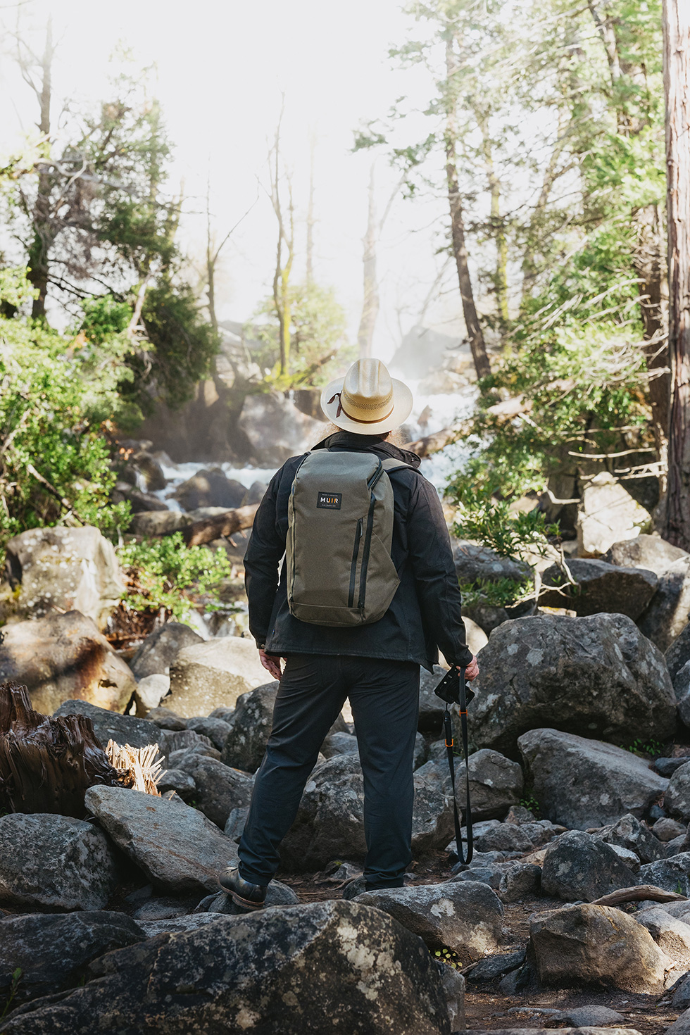
We love working on these collaborations with the best brands and people in the world. It’s a passion, an honor, and truly a pleasure. The excitement is mutual, with our community worldwide enjoying these collaborations on their daily adventures.
While we can’t rank our favorite brands and collaborators, working with our friends at Trakke is definitely a highlight. They are experts in the softgoods industry, with multiple Carry Award wins. Their small team in Glasgow handcrafts each piece of carry with such skill and care – making them truly special.
Alec and I chat regularly, sometimes about life, other times about design. Our frequent jams naturally led to the idea of another collaboration, inspired by John Muir. His legacy as an adventurer, writer, conservationist, and visionary perfectly embodies our project’s spirit, connecting Scotland (Trakke’s base) to the United States (Carryology’s design base).
For our fourth collaboration, we aimed to surpass the Muir Backpack Project.
The John Muir Story
John Muir was born in the small village of Dunbar, Scotland in 1838. Then, in 1842, he emigrated to the United States.
While there, Muir made legendary accomplishments as a naturalist, author, environmental philosopher, botanist, zoologist, and glaciologist, and he was an early advocate for the preservation of wilderness in the United States of America. His most famous undertaking, which is how he earned the nickname “Father of the National Parks”, is by far his most important.
In 1903, Muir, who was a somewhat known author at the time, reached out to the President of the United States, Teddy Roosevelt and he pitched… get this… a 3-day camping trip together in the Yosemite Valley. Imagine doing this today. You’d have the Secret Service at your door in minutes. Despite this incredibly bold Hail Mary invitation, Roosevelt accepted. That camping trip would change the fate of the outdoors as we know it forever. Muir’s entire goal: to show the President how beautiful and how special the outdoors were. And most importantly, that these areas needed to be protected.
It worked. And today, people are still reading Muir’s works, and are inspired by his message and actions, and dozens and dozens of locations are named in his honor. Muir was the perfect embodiment to inspire the direction of this project: the Scottish-US connection and culture, the love of the outdoors, epic travel, and rugged exploration.


Evolution
We both thought… for our fourth collaboration together, how could we top the Muir Backpack Project?
As Alec mentions in our Muir III Design Discussion video chat, the first thing we did was step back and identify what we loved and what didn’t work as intended in the previous project. We’d focus on the new opportunities created by addressing the negatives, ultimately improving and creating something better. What’s not to love about that?
So we broke down the Muir Backpack, piece by piece. We examined all of the successful aspects. And we weren’t shy about openly admitting where things could have been executed better.
A few of the positives:
Two bags in one (backpack and sling)
A very unique silhouette
The fabrics (performance and tartan story)
The Muir inspiration story
The highest-performance trims and hardware
A forward-thinking inspired design
Access method and overall features
A few of the negatives:
Two bags in one (backpack and sling)
A very unique silhouette
A bit too “fiddly” and too “strappy”
Fabrics that didn’t necessarily feel “Trakke”
A design that was just doing a little too much
With our list, we decided not to tweak the existing pattern of the last Muir Backpack. Instead, we started from scratch. This marked the turning point of our collaboration, setting us on a path to create something new and amazing. Our main focus was to create something better and more useful for you, the reader and end user.
Access and 1 ½ Bag Travel
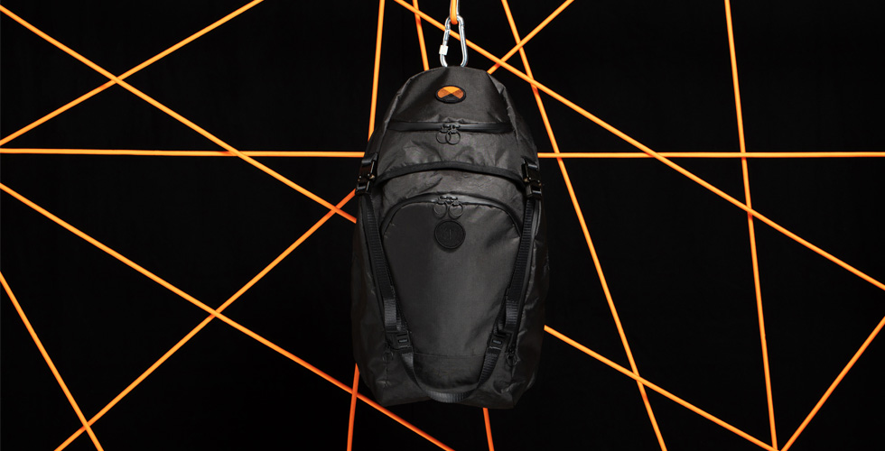
We knew it would be a backpack with a “horseshoe” style access opening and a sling, fitting our one-and-a-half bag travel philosophy. Discussions, ideations, sketches, pattern making, sub-assemblies, and prototyping began.
We tested the early prototypes during travel across three countries and eight U.S. states. Using these samples in the field, we took notes and shared them for further refinement until there was nothing left to comment on. Throughout my design career, I’ve found that the most valuable part of the process is testing and solving discovered issues. Test, refine, repeat.
Hydration Stations
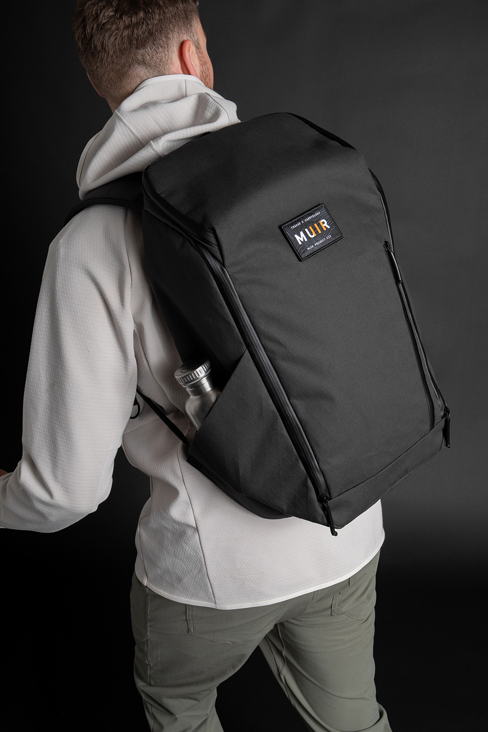
Next, the water bottle pockets. Brilliant in concept, but not executed to our liking. We took the same idea, but applied some Trakke expert tailoring to make them perfect.
Now, the pockets lie entirely flat when not in use, pulling in tight mechanically due to the shoulder strap tension while wearing it. But when you need them, they swallow up a 1-liter Nalgene (or scotch) with ease.
Sling With Ease
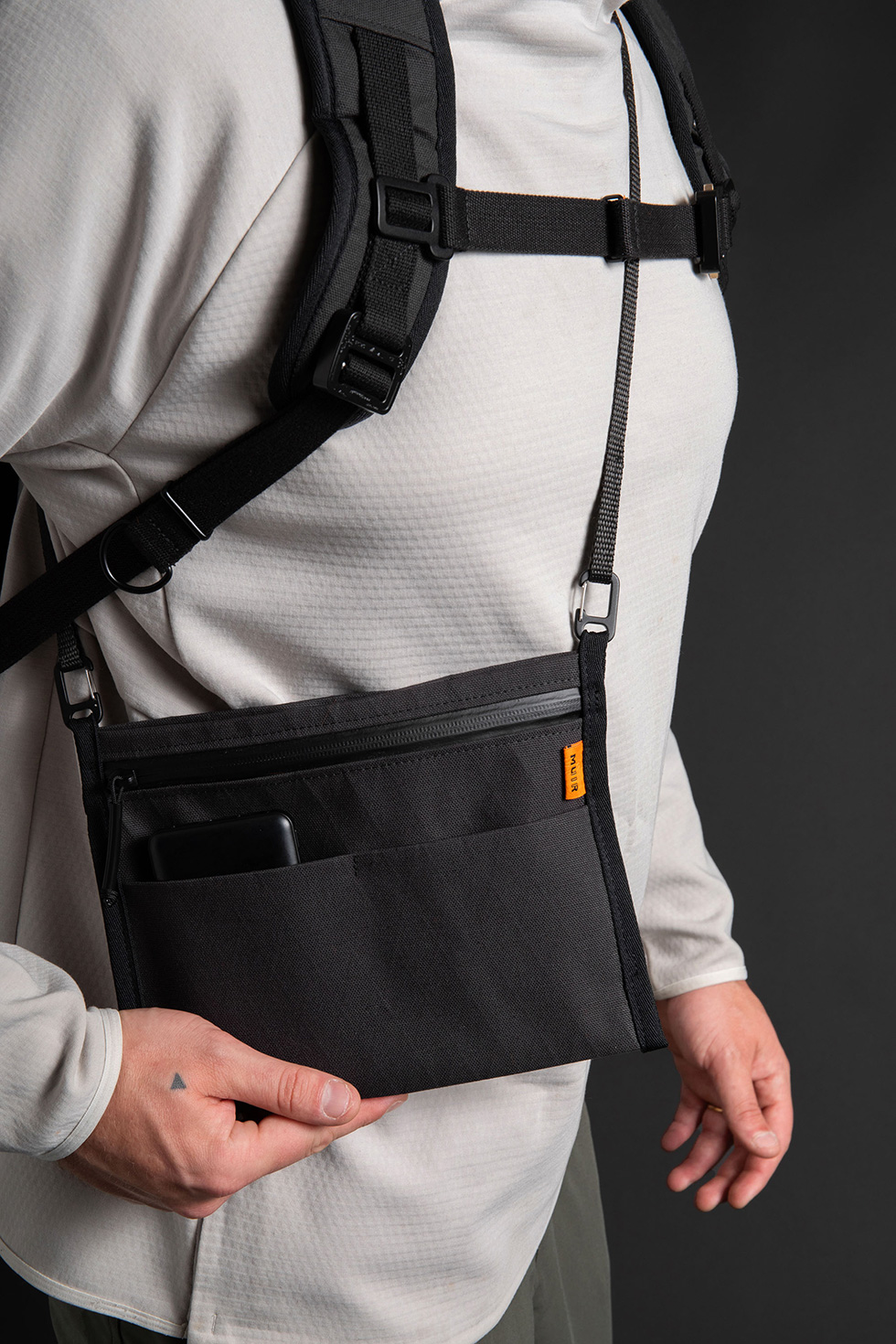
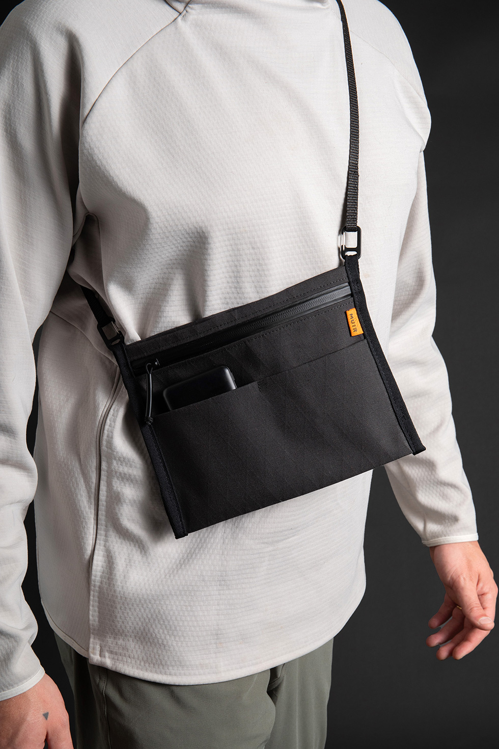
Relocating and simplifying the sling was essential. The exterior sling mount was a little fiddly at times, so we aimed to streamline the process through improved patterning and design. Alec, who had been using the Trakke Gigha Sling extensively, suggested it as a solution for the Muir III. After testing it, we agreed it resolved many issues.
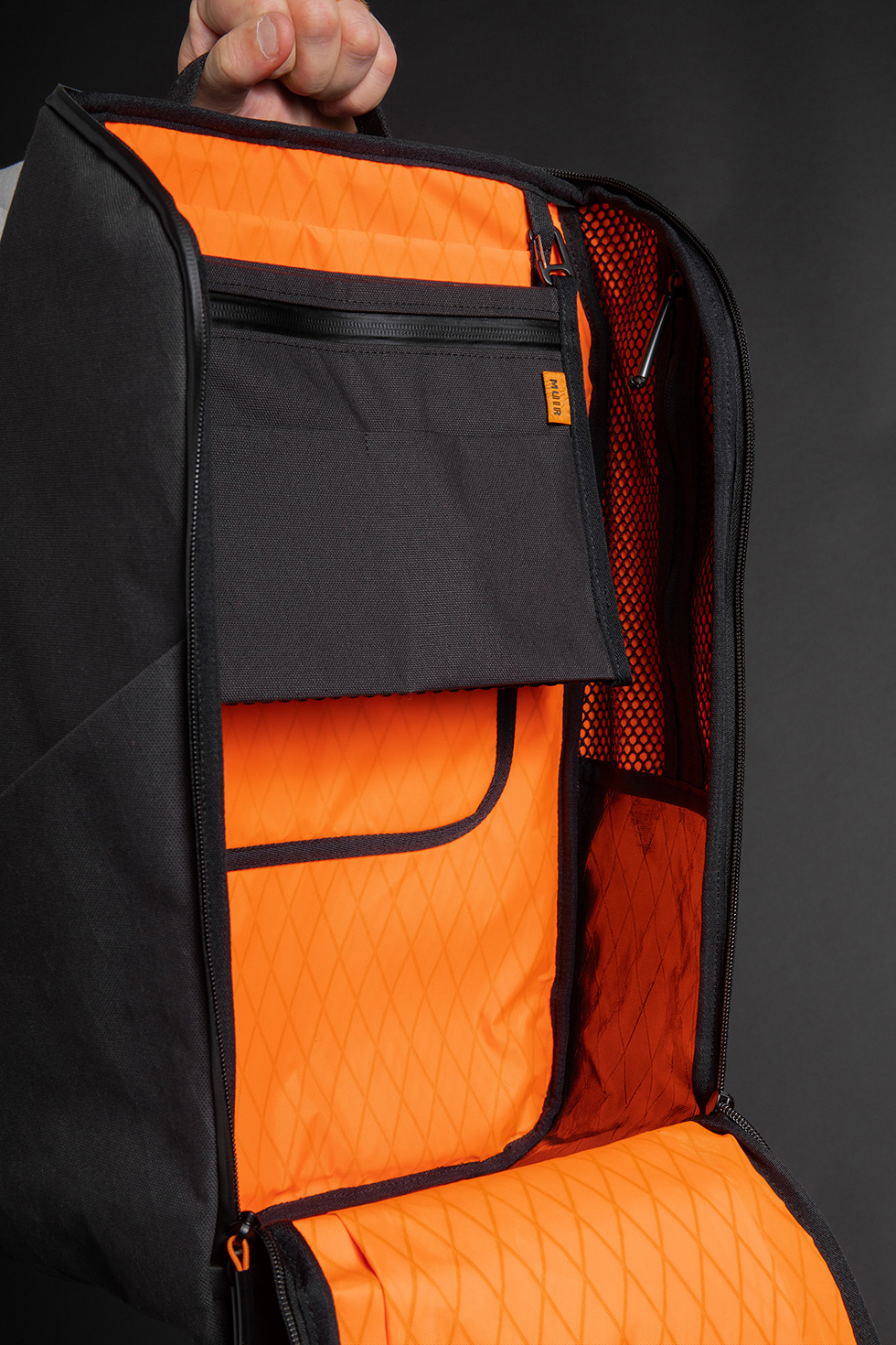
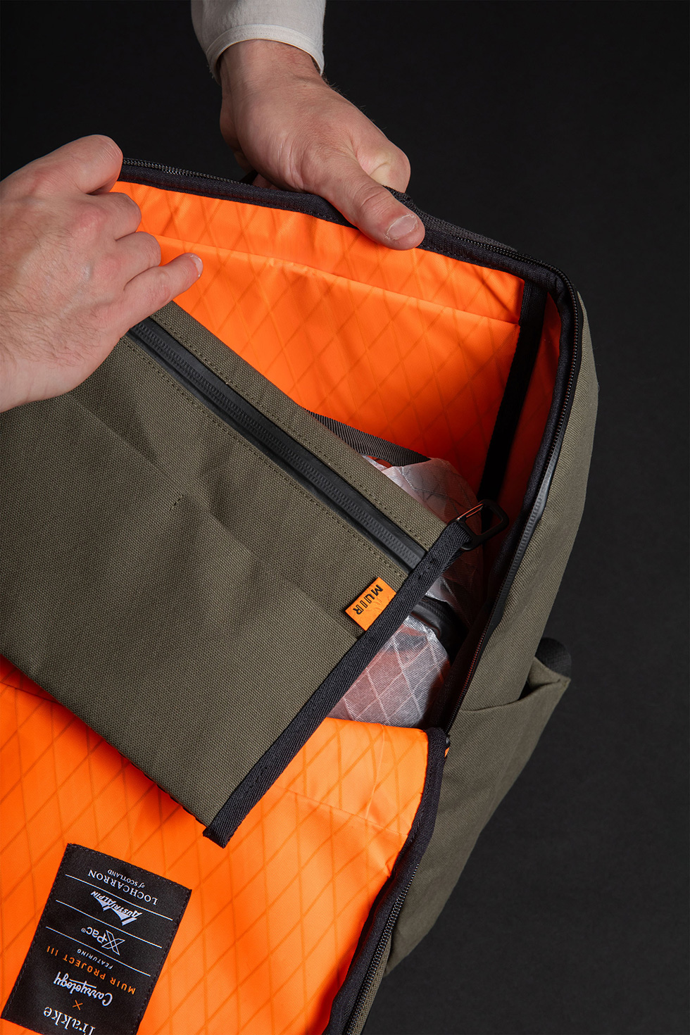
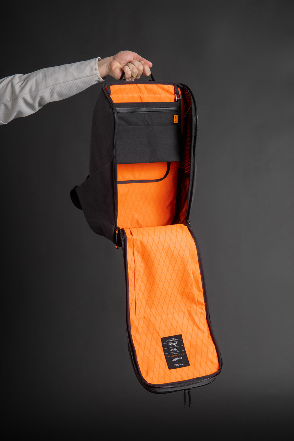
The sling now hangs tidily on the backpack’s interior rear main wall, acting as an admin organizer. When needed, simply unclip it and toss the modular webbing strap over your shoulder. With some expansion built into the main compartment and three exterior pockets, it carries just enough for daily items, keeping your pockets clutter-free. Alec particularly loves that the semi-flat design allows the sling to disappear under a jacket while traveling. No more magnets or excess straps.
The pack’s volume is 25 liters, with an additional 2 liters from the sling, hitting the sweet spot for everyday carry and light travel. One-and-a-half bag travel, solved with simplicity.
Cleaner Pattern
Having solved the sling portion with a minimalist approach, we avoided adding extra darts and more complicated panelwork, keeping the design clean and simple.
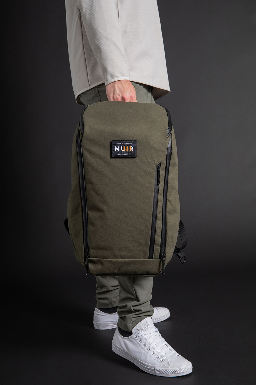
We retained the horseshoe-style main compartment opening, a favorite from the original Muir, as it provides versatile access without fully opening the pack.
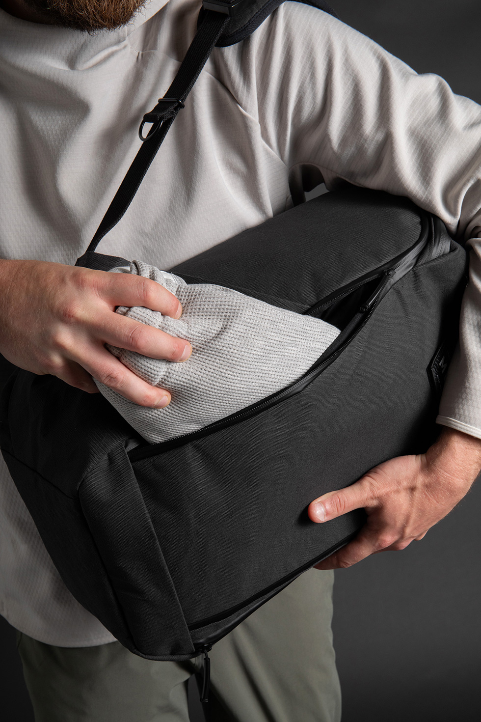
Four zipper sliders offer ingenious access: leave two sliders at the top center for a full clamshell opening, and use the sliders at the bottom on each side for quick access to the main compartment.
This setup provides three different ways to access your gear, ensuring convenience and efficiency.
QAP
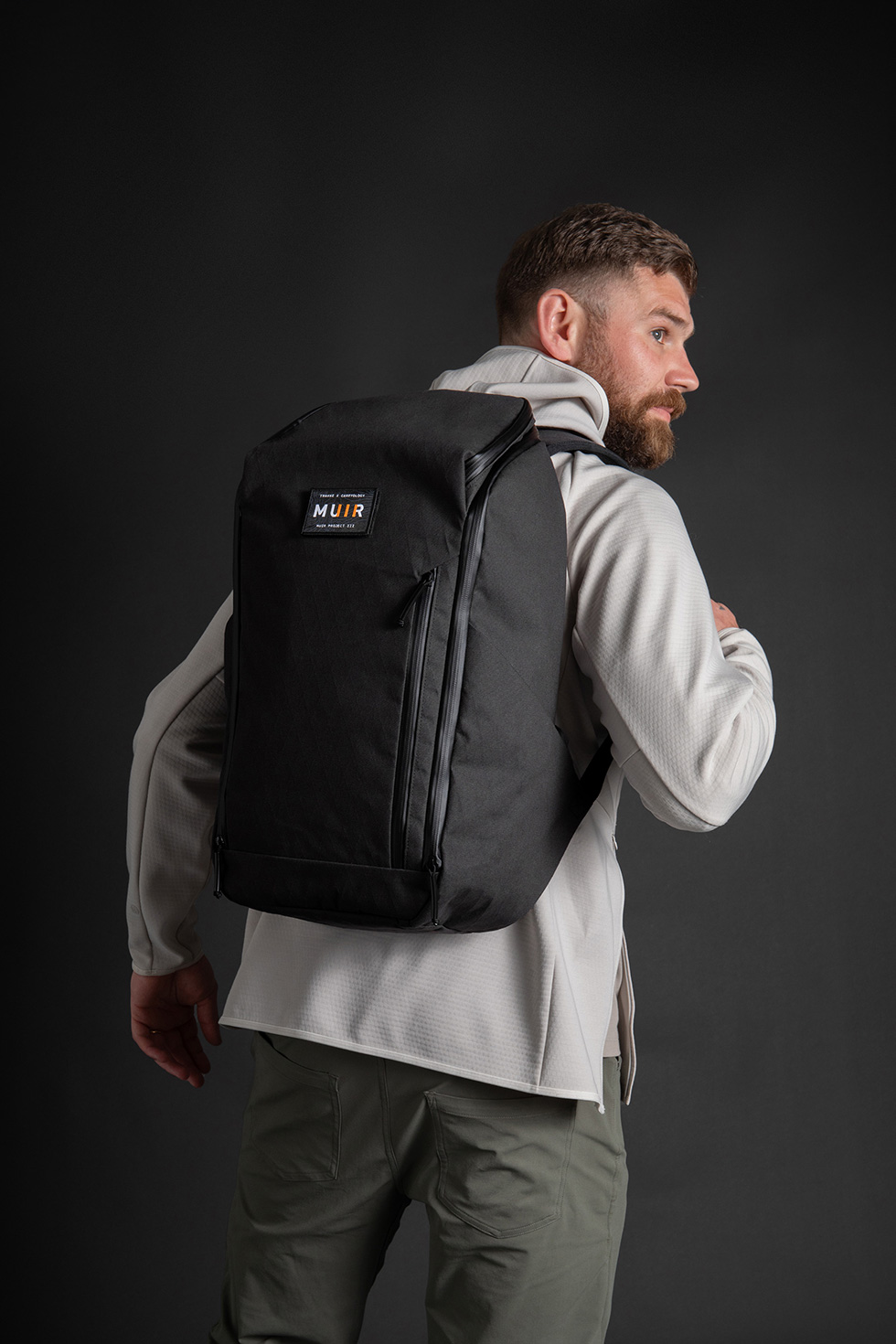
With the new patterning improvements, we enhanced the exterior features. We added a large compartment on the front face of the horseshoe panel, accessible via a vertical zipper, providing quick access and ample space for a tablet.
Additionally, with the sling no longer on top of the horseshoe access, we incorporated another quick-access, inverted U-shaped pocket on the top lid.
Inside, you’ll find a zippered compartment for securing small items and two mesh drop pockets at the bottom. By removing and refining, we effectively added more useful pockets.

Internals
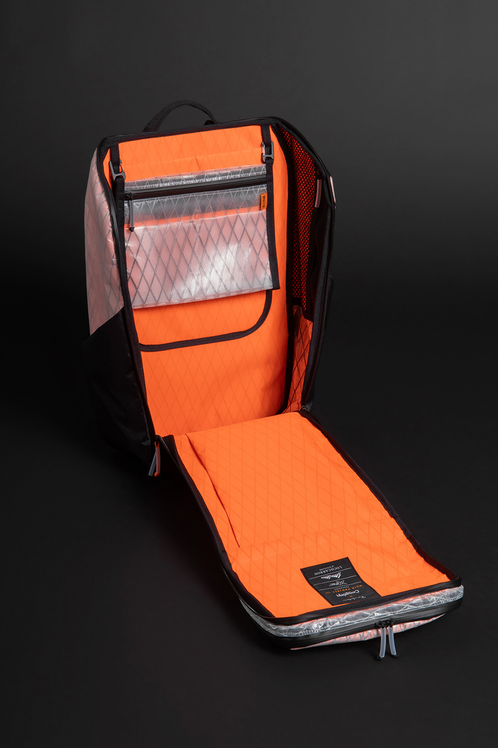
Inside, we kept things simple. With the Giga Sling serving as an internal admin pocket, we avoided adding unnecessary pockets that would increase weight and complexity. However, we did want to make the most of the horseshoe access design for better organization. On the rear wall, there’s a suspended padded tablet sleeve made of RVX25. The side walls feature mesh pockets with vertical zippers to keep bulky items elevated. Since the front exterior wall of the horseshoe panel already has a large accessory pocket, we kept the internal wall clean. This prevents sagging and overstuffing, ensuring the panel doesn’t slam down when accessing the contents.
In Comes X11
For the Muir III Backpack fabric, we wanted something inspired by Trakke. We aimed for a fabric with a blend of past and future, Scottish and American influences, providing high-end performance. So, we searched extensively.
Waxed cotton made sense but felt too conventional for a collaboration, as it’s already used in Trakke’s products. Dimension Polyant X-Pac, while excellent, seemed too aligned with the Carryology side. We wanted the waxed canvas aesthetic with X-Pac performance. The challenge was how to use both.
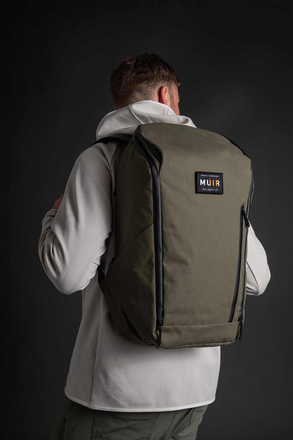
So we contacted numerous resources and consulted Taylor North at Dimension Polyant for fabric options. He introduced us to the X11 fabric, a unique blend of cotton canvas and X-Pac qualities. It combines a cotton 10z heavyweight canvas with polyester for durability, coated with a DWR for water resistance. The canvas is then laminated with DP’s black post-consumer recycled polyester X-PLYs for strength and waterproofing. This fabric offers the strength and waterproof features of X-Pac while also providing the hand-feel and patina of waxed canvas. It’s one killer hybrid of both materials!
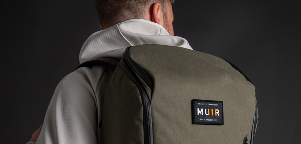
Even better, the pack will be available in two colorways: a night sky Black for urban/travel and a nature-inspired Olive approved by Muir.
Liner Notes
Talking about fabrics, let’s discuss the liner. Our philosophy always prioritizes bright interiors for easy item retrieval in the dark. Both Trakke and Carryology favor orange, so we ordered X-Pac RVX25, a polyester face fabric that’s durable, waterproof, lightweight, and brightly colored.
Custom Tartan
One of the highlights of our previous project was the custom Muir-inspired tartan we created with Lochcarron of Scotland, the leading tartan manufacturer founded in 1892. Tartans, with origins dating back to 3000 BCE, have unique histories tied to specific families and clans. Despite past bans on tartan wear, particularly in the Highlands, Scottish history and rebellious spirit ensured its enduring presence.
And just like Muir I, we’re using Dunbar tartan, the tartan from the birthplace of John Muir, but redesigned, of course – and named the Trakke x Carryology custom tartan.
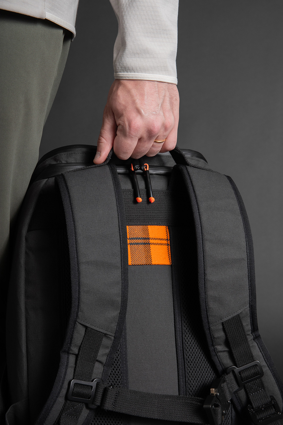
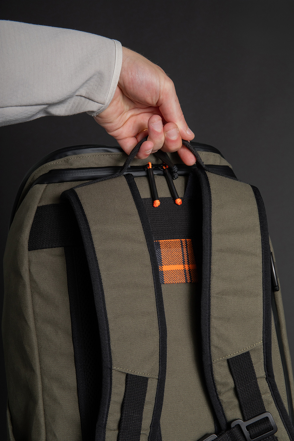
This tartan fabric is perhaps the coolest ever made for a backpack. However, Lochcarron of Scotland’s schedule was booked for many months, making it impossible to request another batch of our custom tartan within our timeline. Fortunately, Trakke’s team had kept some large leftover panels from the previous run “just in case.” Although too small for even the smallest pouches, it would’ve been a waste to discard these pieces. Luckily, they are just large enough to be incorporated into Muir III, in the same location as the original Muir Project on its back panel. We’re excited to include these final pieces of our custom tartan in Muir III, ensuring this unique fabric lives on in the world.
YKK All Day
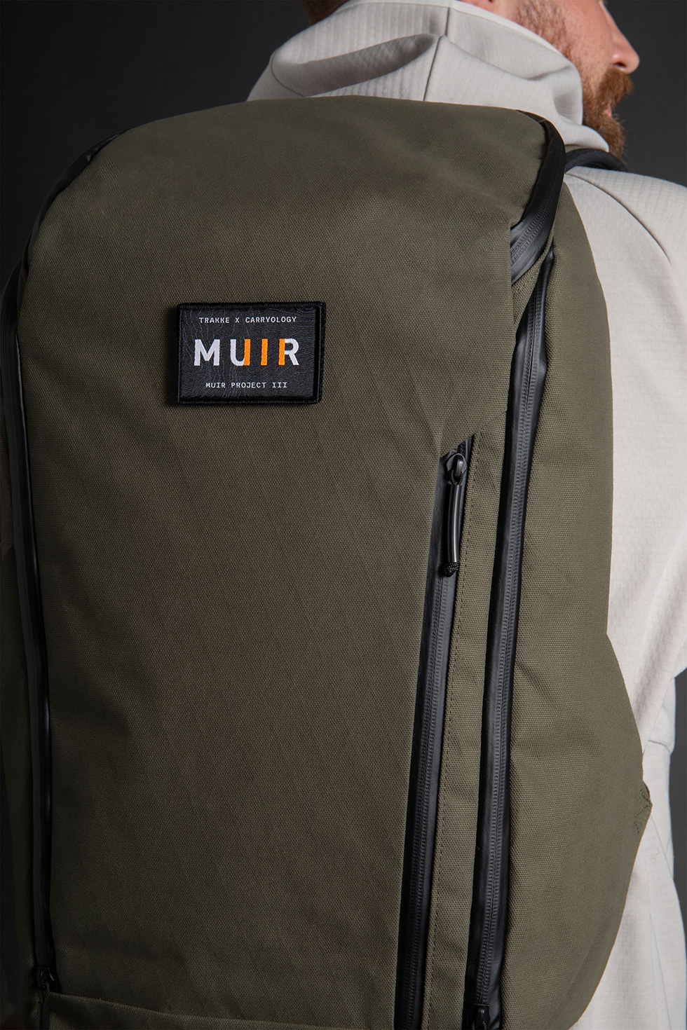
We aimed to design a pack versatile enough for any country, climate, or scenario. Since the exterior fabric is a 100% waterproof laminate cotton canvas, our top concern was preventing water ingress through the zipper openings in every exterior pocket. We achieved this by using YKK AquaGuard zippers, equipped with a new cord and polymer sleeve zipper puller design for durable performance. This combination ensures exceptional weatherproofing.
Tidy Tech
We loved the laptop compartment on the first Muir. Quick and easy zippered access and in the right spot on the back panel. So we kept it. It can be accessed via a YKK AquaGuard zipper, with the pocket lined with the blaze orange RVX25 and plenty of padding to keep your important tech dry, safe, and secure. The 16″ long vertical zipper access easily swallows up a 16″ MacBook Pro, with room to spare. You may just be able to sneak a 17″ laptop in there if you coerce it at an angle.
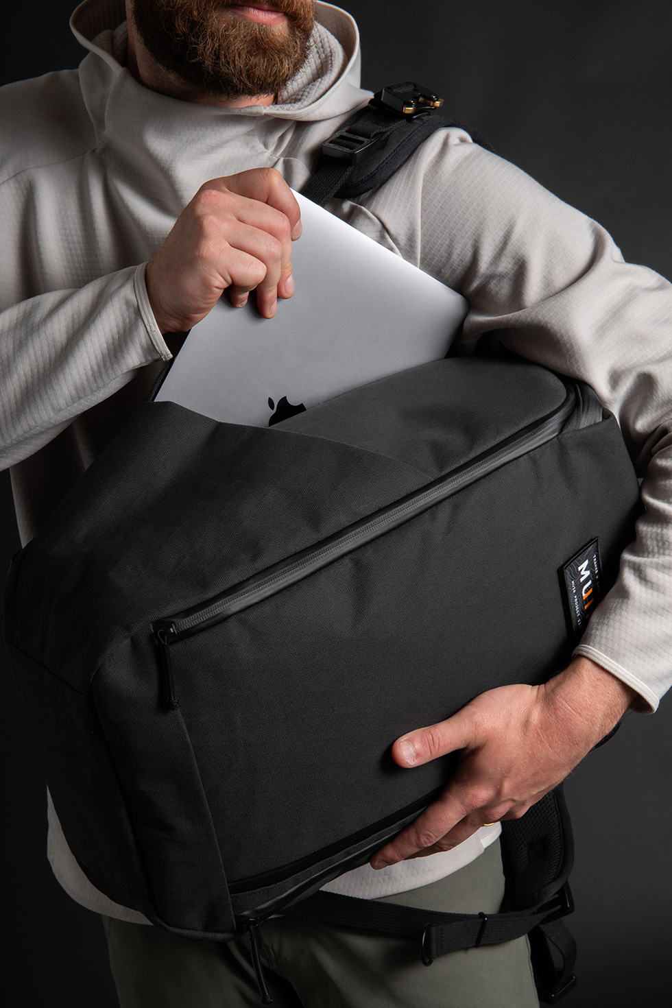
Harnessed Comfort
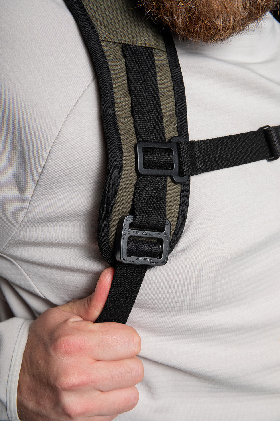
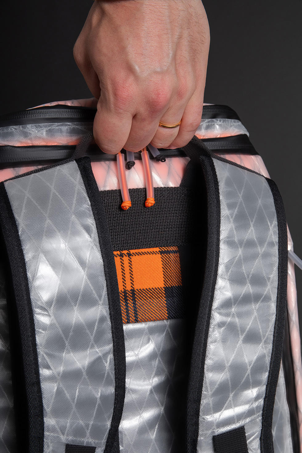
The back panel uses soft but sturdy airmesh with a center air channel to keep things cool and quick-drying. As a fun visual pop, we tossed some of our Trakke x Carryology custom tartan in this channel, a hidden feature when you’re wearing the pack, breaking up the all-black exterior colorway. The shoulder straps are a sandwich of closed cell foam with airmesh on the interior and the Dimension Polyant X11 on the topside for strength. High-strength polycotton webbing controls all the areas of comfort and utilizing heavy duty Austrian-made COBRA Frame hardware at the bottom of each strap to adjust the length to fit.
Morale Patches
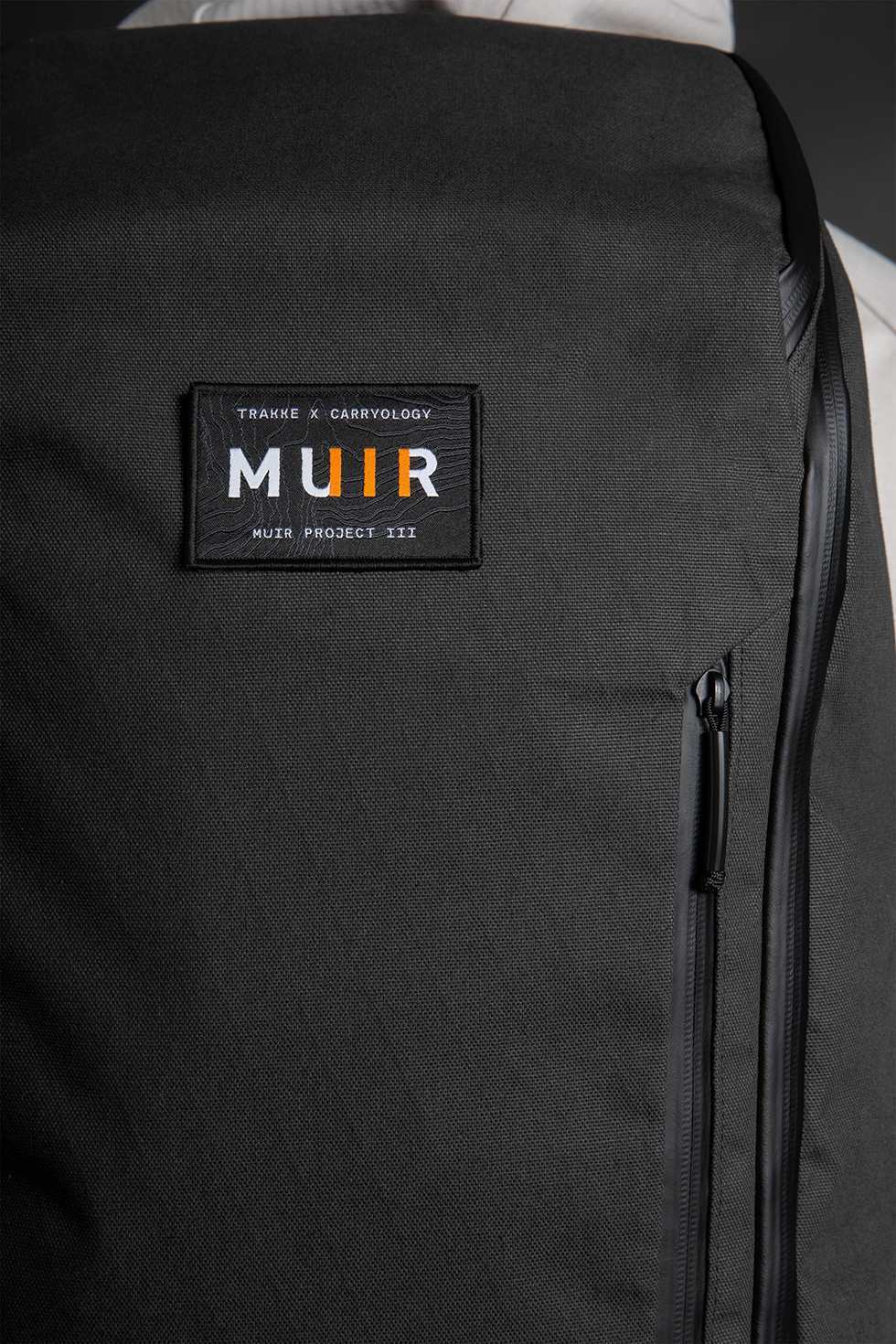
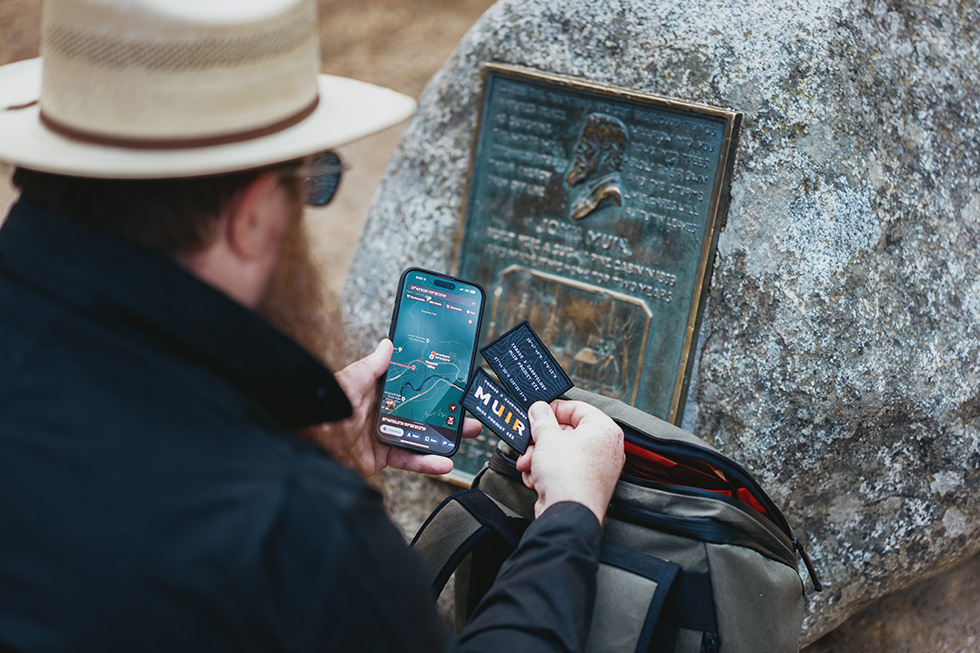
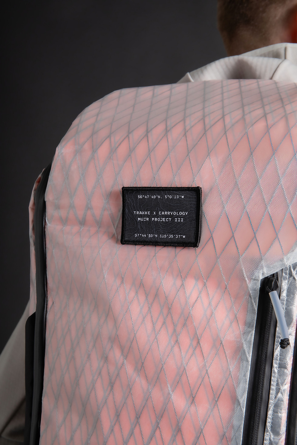
Morale patches add a fun touch. Given the pack’s design, we agreed that a Velcro patch panel was a natural fit. We even expanded the size to the standard 3″x2″ patch. Instead of using the limited tartan pieces, we chose a meaningful design. Crafted in-house at Trakke, the rear topographical map depicts the exact location of Muir’s cabin in Yosemite National Park. Our patch features a bold and iconic “MUIR” with three vertical lines in orange for the “III.” As for the special edition patch, we’ll reveal that later.
Cubed x Cubed Organization
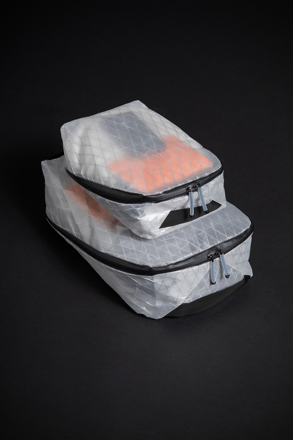
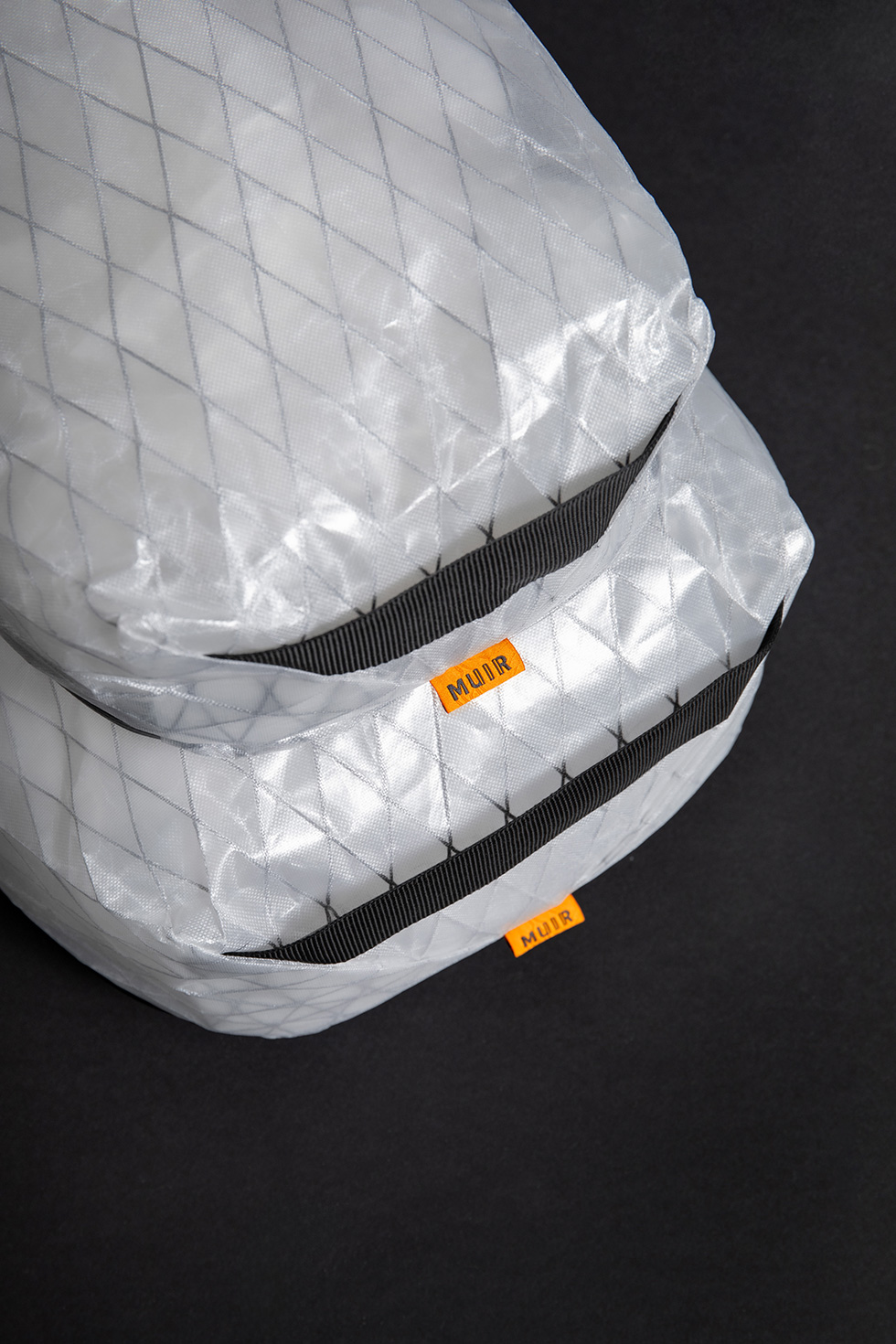
It’s hard to top the Dyneema orange packing cubes from the very first Trakke x Carryology collaboration. Or the custom Muir tartan packing cubes from the previous collab we did. But that was our goal. And in our humble opinion, these take the cake. Based on Trakke’s Foulden Clamshell Packing Cubes, they have a wide 270 degree clamshell access to all the goods inside and a grab handle on each end. Sold as a set of two (Small and Large) they are perfect sized for everyday carry organization and travel. Custom Muir branding and made from space age technical fabric UVX10 that is semi-transparent so you can see your items inside.
Watch a walkthrough of the Muir III backpack with Alec from Trakke.
Handmade in Glasgow, Scotland
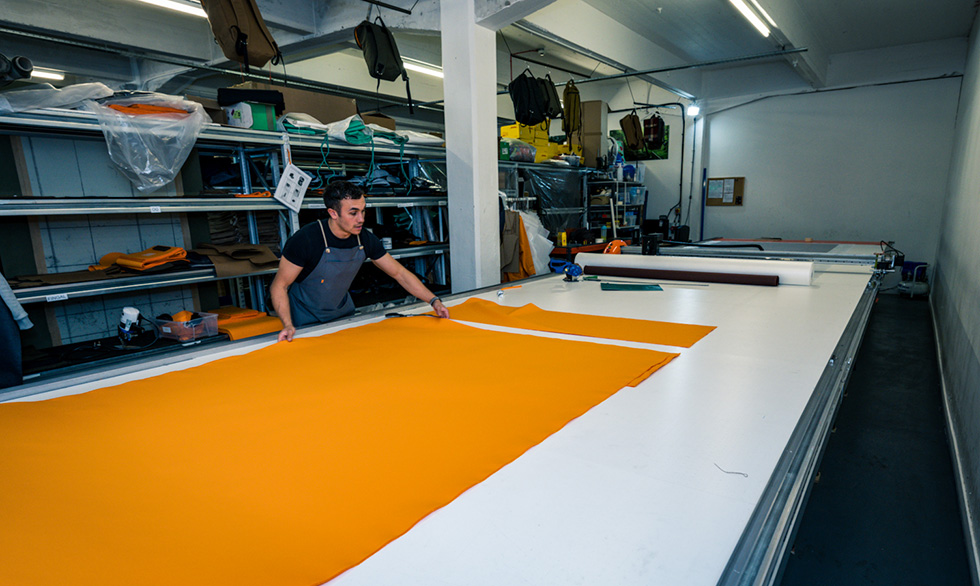
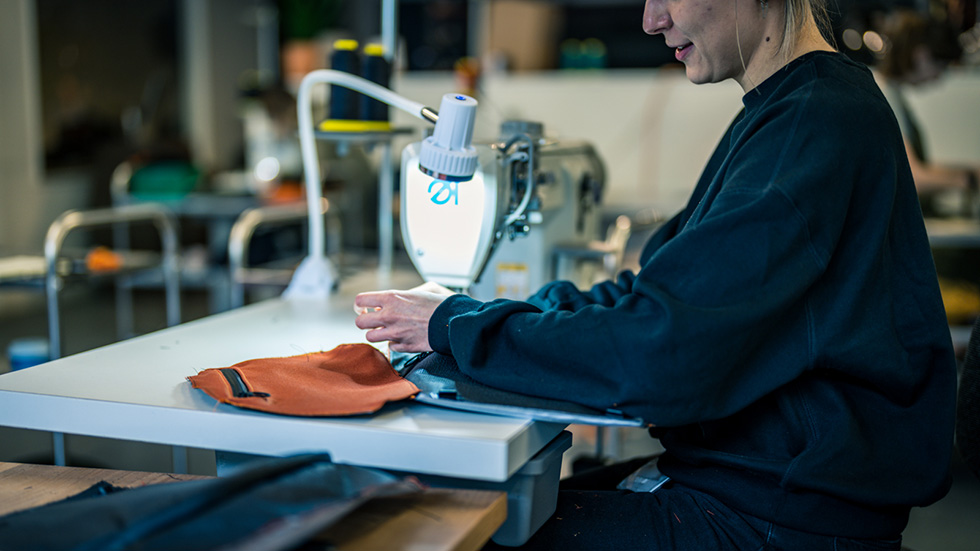
Trakke is extremely unique in that they manufacture their own products in-house at their Glasgow-based headquarters, via a team of expert craftspeople. Each one is painstakingly handmade here, paying an honest working living wage for UK employees. No outsourcing here. The result is a brilliant example of a small batch production, proudly and expertly made in the UK.
Oh. And there’s one more thing…
Just like the last Muir Backpack. We had to offer up a wild version.
The X11 is a perfect blend of future/past and Scottish/American. But, it still visually looks like waxed canvas, in the best way possible. So we wanted something that would be an aesthetic smack in the face, exactly like the all-tartan backpack. A serious statement piece.
We asked Taylor North what kind of crazy out-there fabrics he had been loving lately. Sharing a few different options, it was unanimous – we loved UX10. Dimension Polyant’s lightest laminate yet, weighing 85g/m2 while boasting impressive strength specs. UX10 uses a 100% Ultra-PE (UHMWPE) weave with a Ciré finish for an impressively strong, abrasion-resistant pack fabric.
Aesthetically, it’s clear, with the bright orange RVX25 glowing through for a truly unique look. On the bottom, we added an X42 base in white for increased durability and some additional pop.
We’re calling this the ‘Glow Worm’.
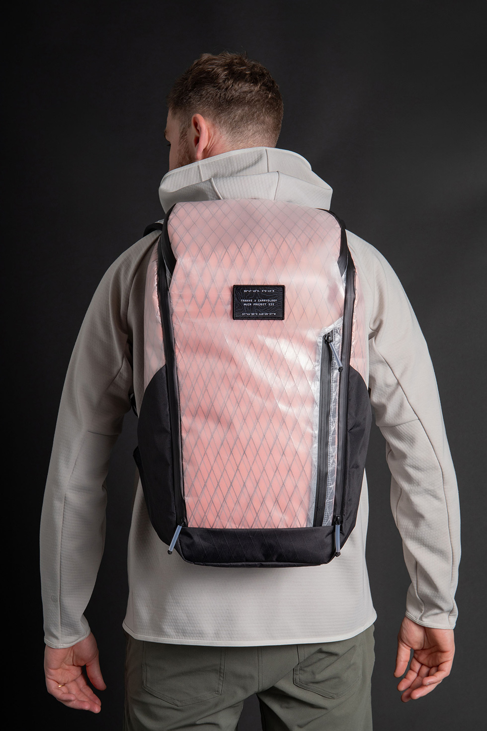
Lastly, this pack comes with its own unique special edition Velcro morale patch. There’s two different GPS coordinates listed here. One is the location of Muir’s birthplace in Scotland and the other is the location of Muir’s cabin, called the ‘Hang Nest’ in Yosemite National Park.
We like having fun. So for those of you who don’t mind making an extremely bold statement, there is an extremely small number of these units available. Definitely one for the collectors among us!
Cheers to the brave folks who can pull off this wild look and cheers to being quick enough to score one!
AVAILABLE TODAY


 Carry Awards
 Insights
 Liking
 Projects
 Interviews
